Support and resistance are two foundational concepts in technical analysis. Understanding what these terms mean and their practical application is essential to correctly reading price charts.
Prices move because of supply and demand. When demand is greater than supply, prices rise. When supply is greater than demand, prices fall. Sometimes, prices will move sideways as both supply and demand are in equilibrium.
Like many concepts in technical analysis, the explanation and rationale behind technical concepts are relatively easy, but mastery in their application often takes years of practice.
What Is Support?
In a downtrend, prices fall because there is an excess of supply over demand. The lower prices go, the more attractive prices become to those waiting on the sidelines to buy the shares. At some level, demand that would have been slowly increasing will rise to the level where it matches supply. At this point, prices will stop falling. This is support.
Support can be a price level on the chart or a price zone. In any event, support is an area on a price chart that shows buyers’ willingness to buy. It is at this level that demand will usually overwhelm supply, causing the price decline to halt and reverse.
What Is Resistance?
Resistance is the opposite of support. Prices move up because there is more demand than supply. As prices move higher, there will come a point when selling will overwhelm the desire to buy. This happens for a variety of reasons. It could be that traders have determined that prices are too high or have met their target. It could be the reluctance of buyers to initiate new positions at such rich valuations. It could be for any other number of reasons. But a technician will clearly see on a price chart a level at which supply begins to overwhelm demand. This is resistance. Like support, it can be a level or a zone.
Once an area or “zone” of support or resistance has been identified, those price levels can serve as potential entry or exit points because, as price reaches a point of previous support or resistance, it will do one of two things: bounce back away from the support or resistance level, or violate the price level and continue in its prior direction—until it hits the next support or resistance level.
The timing of some trades is based on the belief that support and resistance zones will not be broken. Whether the price is halted by or breaks through the support or resistance level, traders can “bet” on the direction of price and can quickly determine if they are correct. If the price moves in the wrong direction (breaks through prior support or resistance levels), the position can be closed at a small loss. If the price moves in the right direction (respects prior support or resistance levels), however, the move may be substantial.
The Basics
Support and resistance can be found in all charting time periods; daily, weekly, monthly. Traders also find support and resistance in smaller time frames like one-minute and five-minute charts. But the longer the time period, the more significant the support or resistance. To identify support or resistance, you have to look back at the chart to find a significant pause in a price decline or rise. Then look forward to see whether a price halts and/or reverses as it approaches that level. As has been noted above, many experienced traders will pay attention to past support or resistance levels and place traders in anticipation of a future similar reaction at these levels.
Technical analysis is not an exact science, and sometimes price will dip below support levels or reverse before it gets to the prior support level. The same is true for resistance: Price may reverse before it gets to the prior resistance level or break above it. In each case, flexibility is required in interpreting these chart patterns. This is why support and resistance levels are sometimes referred to as zones.
There is nothing magical about these price levels. It is simply that many market participants are acting off the same information and placing trades at similar levels.
Most experienced traders can share stories about how the price of an asset tends to halt when it gets to a certain level. For example, assume that Jim was holding a position in stock from March to November and that he was expecting the value of the shares to increase.
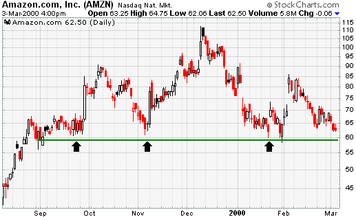
Let’s imagine that Jim notices that the price fails to get above $39 several times over several months, even though it has gotten very close to moving above that level. In this case, traders would call the price level near $39 a level of resistance. As you can see from the chart below, resistance levels are also regarded as a ceiling because these price levels represent areas where a rally runs out of gas.
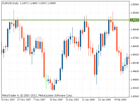
Support levels are on the flip side of the coin. Support refers to the price level on a chart where equilibrium is reached. This means that demand has increased to match supply. This causes the decline in the price of the asset to halt; therefore, price has reached a price floor. As you can see from the chart below, the horizontal line below price represents the price floor. You can see by the blue arrows underneath the vertical line that price has touched this level four times in the past. This is the level where demand comes in, preventing further declines. This is support.
Trendlines
The examples above show that a constant level prevents an asset’s price from moving higher or lower. This static barrier is one of the most popular forms of support/resistance, but the price of financial assets generally trends upward or downward, so it is not uncommon to see these price barriers change over time. This is why the concepts of trending and trendlines are important when learning about support and resistance.
When the market is trending to the upside, resistance levels are formed as the price action slows and starts to move back toward the trendline. When price is moving against the prevailing trend, it is called a reaction. Reactions can occur for a large variety of reasons, including profit taking or near-term uncertainty for a particular issue or sector. The resulting price action undergoes a “plateau” effect, or a slight drop-off in stock price, creating a short-term top.
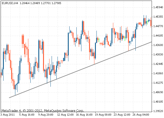
Many traders will pay close attention to the price of a security as it falls toward the broader support of the trendline because, historically, this has been an area that has prevented the price of the asset from moving substantially lower. For example, as you can see from the Newmont Corp. (NEM) chart below, a trendline can provide support for an asset for several years. In this case, notice how the trendline propped up the price of Newmont’s shares for an extended period of time.
On the other hand, when the market is trending to the downside, traders will watch for a series of declining peaks and will attempt to connect these peaks together with a trendline. When the price approaches the trendline, most traders will watch for the asset to encounter selling pressure and may consider entering a short position because this is an area that has pushed the price downward in the past. To be a valid trendline, price needs to touch the trendlines at least three times. Sometimes with stronger trendlines, price will touch the trendline several times over longer time periods. Also, in an uptrend, the trendline is drawn below price, while in a downtrend, the trendline is drawn above price.
The support/resistance of an identified level, whether discovered with a trendline or through any other method, is deemed to be stronger the more times that the price has historically been unable to move beyond it. Many technical traders will use their identified support and resistance levels to choose strategic entry/exit points because these areas often represent the prices that are the most influential to an asset’s direction. Most traders are confident at these levels in the underlying value of the asset, so the volume generally increases more than usual, making it much more difficult for traders to continue driving the price higher or lower.
Moving Averages
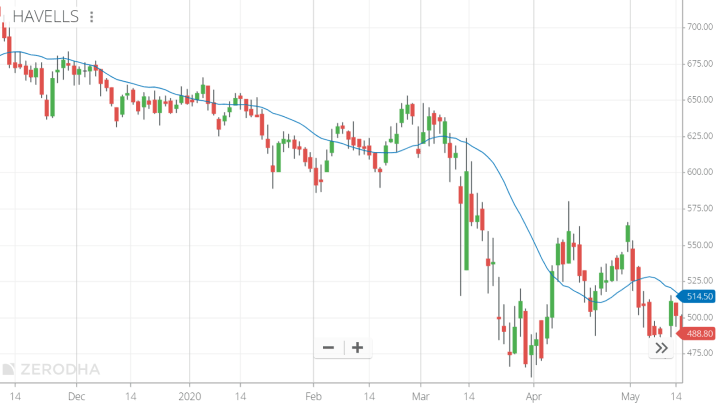
Most technical traders incorporate the power of various technical indicators, such as moving averages, to aid in predicting future short-term momentum. In fact, people who find it difficult to draw trendlines often will substitute them for moving averages. As you can see from the chart below, a moving average is a constantly changing line that smooths out past price data, allowing for an easier identification of support and resistance. Notice how the price of the asset in the chart below finds support at the moving average when the trend is up, and how it acts as resistance when the trend is down.
Traders can use moving averages in a variety of ways, such as to anticipate moves to the upside when price lines cross above a key moving average, or to exit trades when the price drops below a moving average. Regardless of how the moving average is used, it often creates “automatic” support and resistance levels. Most traders will experiment with different time periods in their moving averages so that they can find the one that works best for their trading time frame.
Trading Ranges
Trading ranges can sometimes occur. These are areas where support and resistance levels are relatively close and price bounces between two levels for a period of time. Experienced traders will sometimes trade within these trading ranges, which are also known as sideways trends. One strategy that they use is to place short trades as the price touches the upper trendline and long trades as price reverses to touch the lower trendline. This strategy is extremely dangerous, and it is much better to wait to see in which direction price will break out of the range and then place your trades in that direction.